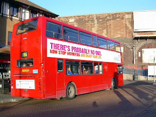
Here is some of the existing bus adverts I have looked at for my research:
After looking at different bus adverts these are the conventions I recognised:
-Fairly plain with a small amount of information, they state the main details
-Large text to stand out
-Either contain just text, or an image/logo as well
-Not a particular colour, several of the existing bus adverts used different colours e.g.blue and white backgrounds and orange, pinks and reds for the text colour
Any images that are used are completely related to the topic of the advert. In addition, the colours used are based on the topic of the advert or if its a business its the colours that they associated with themselves. For example the EasyJet advert uses orange and white because this is the colour of their logo.
.
I am also creating a bus top advert as part as my ancillary task and therefore I also researched existing bus top adverts to identify their key conventions.
Bus stop adverts have similar conventions to a bus advert as they contain little information and achieve advertising by stating the key details.
They also use the colours that are associated with the business or the topic of the advert. They use large text to make the key information to stand out the name of the business or brand is shown smaller. Therefore for my advert I would put the name of the band smaller than the text stating what is being advertised which is going to their new single.
I will use colours associated to the band and the colour scheme that me and the rest of my group has established for our ancillary tasks. These are dark grey/blue, black, white and red.
Each bus stop advert always consists of a logo and a few tag lines. Backgrounds are usually fairly plain, even if the background is an image.


No comments:
Post a Comment