Welcome I am a fellow member of 'Team Go For Gold' :)


Friday, 18 March 2011

EVALUATION - Choices and Outcomes

During our principle photography we had to make changes to our locations. We initially planned to use a lake/river for the ending shot which consisted of the girl standing in front of it and the reflection of the boy in the water. However, we was unable to find a suitable location of this shot, therefore I came up with the idea in Trafalgar Square to use the fountain for the end shot.

I came up with the idea to have the boy and girl at the opposite sides of the fountain where they notice each other and then meet in the middle.

Shot of fountain:


Therefore this shot has the same impact as the intitial idea of the reflection in the river because it is still an effective way to show them meeting eachother. The shot of the fountain suggests that they are on seperate sides representing their seperate lives but come to middle to join together as one.

Whilst filiming up London we also thought of additional ideas to include just so we had extra footage and had the option to use it. We filmed additional footage at The Embankment where the boy was sitting on the wall and the girl walks past the skaters. We also filmed the skaters to establish the location that both of the characters were.


Thursday, 17 March 2011

EVALUATION - How I used media technologies to construct, research, plan and evaluate

How did you use media technologies in the construction and research, planning and evaluation stages?

During this project I have used a wide range of media technologies during my stages of construction and research, planning and evaluation.

Research
The internet played a big part of my research stage because this enabled me to research a variety of media products to help me to plan and construct my ancillary tasks.

For my website I researched into several music websites to establish their typical conventions as my website will need to develop and use these conventions to ensure it was suitable for its purpose. The majority of them were alternative rock band websites as Kings of Leon are this genre, therefore my website needed to fulfil the conventions of this music genre.

These are some of the websites that I used for my research:

http://www.kingsofleon.com/
http://www.kasabian.co.uk/gb/home/
http://muse.mu/

Construction

For the construction of my ancillary tasks I have used Adobe Photoshop, Adobe Illustrator and Adobe Dreamweaver. For each of my ancillary task I have used Adobe Photoshop to edit my images which I have then imported into the other software to create my products. For example, the image I have included on my bus advert I originally edited in Photoshop. I used Photoshop to crop the image, alter the brightness and contrast and change the auto levels of the image.

Another example of combining the software’s together was when I edited my image for the header of my website by removing its background and changing it to black. I edited this background to go with my background colour of my header.

I also used Adobe Flash to create my slideshow for my website. However to create my slideshow in Adobe Flash I used Adobe Photoshop to create the three different images. Once I created these images I imported them into Adobe Flash and converted them into movie clips to create my slideshow. By exporting this media I could import into Adobe Dreamweaver. By using the three software’s together I was able to create the slideshow for my website.

Adobe Photoshop:


Adobe Flash:

Planning

Evaluation
For the planning process of my project I used Microsoft Word to create computer sketches of my final designs as by using this they would be much more accurate and detailed. In addition, I used Adobe Photoshop to edit some of the images in order to gain an idea of what they will look like with my design. This enabled me to identify which colours I could use which will match the style of the images. 
For my evaluation I have used Blogger to upload videos and to post blogs to evaluate what I have done throughout this project. By uploading videos I have been able to include interactivity and demonstrate some of the stages throughout my production process. For example, I have uploaded videos which show me and the rest of my group filming for our principle photography and a podcast which consists of me talking about the bus advert I have created for my ancillary and comparing it with existing bus adverts. In addition, I have included another video which consists of some of the outtakes from our filming.  


I have also compared shots from our video with existing videos and demonstrated ones that are similar or identical. This is evidence that we have developed these conventions into our main product for this genre and the typical shots found in a typical music video. I have included video links to the video’s I have looked at to undertake this, some of them I have uploaded onto my blog post from YouTube.

Wednesday, 16 March 2011

EVALUATION - Outtake Video

Today me, Kate H and Louisa went through our footage to find the outtakes. We had originally renamed some of our footage and put them into folders, however we wanted to ensure that we had all of our possible outtakes for the outtake video we planned to create.

After identifying all of our outtakes we wrote down on a piece of paper where they are located and the names of each of the different files. After this I used my study to import each of these files into Adobe Premiere Pro to create an outtake video. I cut the footage down so that the suitable sections were kept and put these shots together on the timeline.

I have completed the video which is just over thirty seconds long and have also exported it so that I was able to upload it onto here.

Here is the outtake video I created:

EVALUATION - Comparing my bus advert with existing product


This is my most recent version of my bus advert


Before I designed and created my bus advert, I looked at existing bus adverts to identify the key codes and conventions of this style of advert.
I identified that they are fairly plain as they include as less content as necessary because they usually consist of just the key information.
The adverts use large text to make the information stand out, in addition some adverts would only include text, however others also consist of an image or logo to represent the brand/product.
They do not use a particular colour scheme, they usually use colours which associate with the business or the topic of the advert.
By using this information and creating a plan for my bus advert, I have produced several versions which have finally developed to my most recent version which is shown above.
The first existing bus advert has a plain white background with large text, an image and smaller text which provides the audience with details about the dates of the show.
The second existing product consists of large text which states the author and the name of the product, in addition an image of the product. It also consists of smaller tag lines which explain where and how the book is available.
Both products show the key details being advertised as they consist of a minimal amount of content.
My bus advert consists of large text which states the name of the band and the product which is their new single. I have used a black plain background to keep it simple, plus I have used black to link to the alternative rock genre and to link it to my group’s style for our ancillary tasks.
Using black also ensures the text and images on top stand out very clear which will capture the audience’s attention.
Similarly, I have included an image of the product just like what the second product. On the right hand side is an image of the front cover of the single, followed by information which states where it is available to buy.
Previous bus adverts that I researched included logos to represent the business or brand, therefore I have included the HMV logo to demonstrate where the single is available to buy.
In addition, I have an image of the band which enables the audience to automatically identify who the advert is about.

EVALUATION - Evaluating my website with existing web pages

I compared the home page of my website with an existing home page of a website. I compared it with Biffy Clyro's official website and I have identified that they have similar conventions. These conventions are the header which consists of the band name in bold text, followed by the navigation bar underneath. This is what I have included on my own website which follows the conventions of the existing one.

Another convention is the slide show; Biffy Clyro's slideshow is used to display information about the band. I have implemented this feature into my own work by including a slide show which consists of three images. The images display information about the band's new merchandise available, a quote about their latest performance from Kerrang Radio and an image advertising a box set of their albums.

Their home page has also been laid out in sections which I have also done of my home page to distinguish the different topics of my website. Down the right hand side of the page I have a section which states Kings of Leon's tour dates and beneath the slide show I have a section that shows the featured articles from the 'News' page.


This page on the Kings of Leon website is the biography of the band. The page consists of many paragraphs of main text on the left hand side which explains how Kings of Leon came about and their history. There is also a video on the right hand side of the band playing live.

I have included an article of the history of the band and the opening paragraph explains all of the members of the band and where they are from. I have also included an image of the band in the middle of the text to allow the user to grasp an understanding of who the members of the band are. On the right hand side I included a fact file. On the original Kings of Leon website they included facts within the text, however to make these facts more noticeable and easier to read I chose to include a fact file as it makes the page more interesting and it enables the user to learn about the band more easily.

I have also included a video on this page which consists of behind the scenes footage of their newest video (this is the video we are making for our coursework). This enables interactivity for the user as they can watch this and the video I have inserted consists of controls which enable the user to play, pause and stop the video.

I compared my home page to the home page of the original Kings of Leon website. One of the conventions that are identical is the section showing a feature of the band's tour dates which is on the left hand side of the original website. I have included this feature in my work on the right hand side of the page.

I have included similar content because I have included pages 'The Band', 'News', and 'Gallery'. This content is all featured on the original website because these are typical topics to find on a band website. Therefore this shows that the information on my website follows the typical conventions of a band website.

Tuesday, 15 March 2011

EVALUATION - Our video with existing music videos

After completing the rough cut of our video, I have analysed the different shots we have used and where they have been used in existing music videos.

I looked at the song 'Numb' by Linkin Park and this video consists of a similar time lapse to the one that we have included in ours. In the video, each of the three shots shows the crowds around the girl in the video rushing past her.

This shot consists of the girl being still and everyone around her moving quickly. There is another two shots in this video where this technique has been used.


We have used a similar shot to this in our video. As the narrative of our story is about the girl being lonely and this is shown when all of her friends let her down at the last minute when she is supposed to meeting them in London. We have included a shot of our girl model standing in the middle of Trafalgar Square and everyone is rushing past her.

We achieved this shot by filming our model standing still for three minutes whilst crowds of people went past. Once we imported this footage to our timeline we were able to alter the speed/duration to 2000% to speed it up significantly. This shot is to represent her loneliness and the concept of her being a girl alone in a big city as Trafalgar Square is a famous landmark in London.


This video is also a good example of a mixed style of video including a narrative and band shots. The narrative is consistent throughout the video with shots of the story and a variety of shots of the band which switch back to one another throughout. There are a variety of shots used on the band, for example close ups, establishing shots and panning.


This is similar to the structure of our video as our narrative is shown throughout with shots of our models, however we filmed a band in a studio and these shots are interlinked between the story to create a mixed structure. This is a convention that we identified for our music genre before we began to create our storyboard for our video.

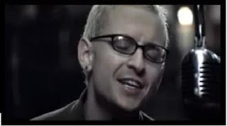
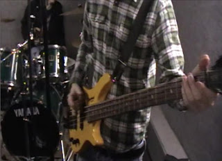
We have used a variety of band shots in our video, these include close ups, mid shots, panning of the three members of the band and zooming.

Close up of singer and lead guitarist:


Close up of bass guitarist:


Long shots which pan across the band members:


I also looked at the original video for the song we have chosen for our project. By looking at Kings of Leon's 'Use Sombody' video I also identified shots that we have used in our own work.

Shot 1
There is a close up shot of one of the members of the band which starts with him with his eye shuts which then open.


We have used a shot like this in our video which is shown at the beginning when our girl model is waking up to start the day. We have a close up of her face and her eyes open in time with the song starting.


Shot 2
We have also used a similar band shot which shows the drummer playing his drums from a side angle. In the Kings of Leon video they have a shot from the left hand side, however ours is the same type of shot but is filmed from the opposite perspective (the right hand side).

Original video - from left-hand side

Our shot showing the drummer from the right-hand side

Shot 3
From Green Day - Boulevard Of Broken Dreams


This video uses a close up of the bass guitarist in the band. We have also included a shot identical to this in our own video.
Shot 4
We have used a close up shot of our singer singing into the microphone. I found a similar shot to this which has been used in Green Day - Boulevard of Broken Dreams


Shot 5

Here is an example of a similar band shot we have used which is a long shot which establishes the whole band. We have used this shot a couple of times in our video to show the whole band playing together.


DEVELOPMENT - Development of bus stop advert


DEVELOPMENT & EVALUATION - Video progress

Today I imported the footage that me and Kate H undertook yesterday into our timeline. By doing this means that we no longer have any gaps during our timeline and therefore have a complete rough cut.

Here is our rough cut:


We have previously added motion to some of our shots, for example adding a scale to some of our band shots which has created a small pan across our models playing their instruments.

I received feedback from my teacher who suggested some minor improvements that can be made to the video. One of these was to make the video more stylized because it is currently very naturalistic. To achieve this they said to include techniques such as jump cuts which will help to tell the narrative as they can be used to represent a long period of time passing.

For example, we currently had a jump cut for the shot of the girl at the train station when she is sitting down. However, our teacher said to improve this I should add another jump cut because they usually come in three therefore this followed the convention, in addition this technique has been used to signify the time that has passed whilst she has been waiting for the train.

I added motion to some of the band shots because some of them were longer than the others, therefore by adding this movement I was able to improve the effect of the shot. On one of the drum shots I added a rotation of 10 degrees and re sized the shot to make sure no black screen was shown. This rotation adds variety to the shot, from the rotation there is a cross dissolve into a close up of our singer.

DEVELOPMENT - Progress of my website

Today I completed one of the pages on my website and now I am currently working on two more pages. The page I have completed is 'The Band' which consists of the band's biography.

By creating the first page I have saved the header and navigation bar as a template which enables me to use this template for each of my pages. This ensures that the house style is kept consistent and that the features that stay consistent on each page are located at the same place on every page. This ensures every page is linked and uses the same style throughout.